Even More Tales of CGA Colors
An Accurate IBM 5153 Palette and Composite Color Consequences
A lot has been written about CGA graphics over the years; while most people seem to immediately have in mind the default pallete of cyan, magenta, white, and black, the card could do a lot more, especially if you had a composite monitor. I've added several thoughts to the mix over the past few years including my preferences for better color choices that games could have easily made. Now, here's some more on CGA colors! Regardless of whether or not a game used CGA well, what would have been seen back in the day depended on a number of factors including whether or not a true IBM CGA card was used (versus, say, a third party CGA card or a later standard such as EGA or VGA emulating a CGA graphics mode) and the particular model of monitor. Introduced in 1983, the IBM 5153 monitor is one such configuration that would provide a subtle difference compared to what is normally seen today with emulators. VileR of int10h.org has written an excellent analysis of the actual 16 colors an IBM 5153 would display and why; I highly recommend checking out his article The IBM 5153's True CGA Palette and Color Output.
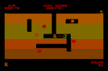
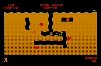
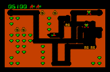
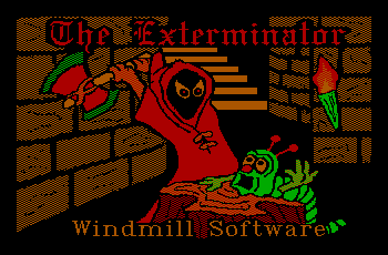
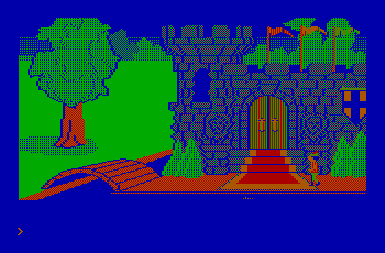
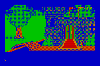
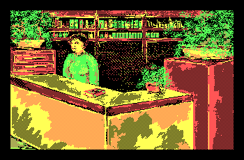
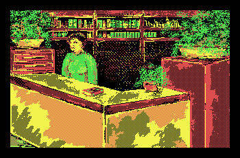
As VileR noted, there's no such thing as the “One True CGA-to-RGB Palette”; for simplicity's sake, you'll currently find that CGA screenshots here at PixelatedArcade use the typical, canonical CGA palette. I'm hoping at some point in the future to implement a feature that allows different color sets to be selectable in order to simulate different monitors (similar to how some monochrome shots allow and amber, green, or white selection), so if and when I get around to completing such a feature I'll be sure to post about it [Edit: Several different monitor types are now available for selection, see New Screenshot Color Features for more information]. But in the meantime, how would this subtle difference actually look for some games? Here's a few examples...
| CGA Color Comparison | |
| Canonical CGA Colors | IBM 5153 Monitor CGA Colors |
 |
 |
 |
 |
 |
 |
 |
 |
| CGA Color Comparison | |
| Canonical CGA Colors | IBM 5153 Monitor CGA Colors |
 |
 |
 |
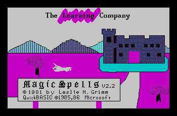 |
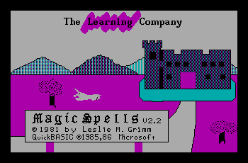
Although from a different manufacturer than the IBM 5153, I've found the IBM PCjr's RGB display to have colors nearly identical to the 5153. Some Tandy monitors I've tried are particularly bad; the red and brown are incredibly similar, even more so than seen in the canonical CGA palette which ends up making some games using this palette look rather lousy, even by CGA standards. Third party monitors can be all over the place, with a small handful not supporting high intensity colors or not containing the circuitry to make dark yellow appear as brown.
Now, how about some more CGA composite graphics?
When an Old Model CGA Card Mattered
Around 1983 or so some changes were made to the CGA card that only affected the composite video output. CGA's color on a composite display could consist of either direct colors (those generated by the card so the signal had chrominance information) or artifact colors (those which resulted purely from NTSC artifacting and were not part of the signal). The main change implemented on the newer cards was additional circuitry for direct colors; on older cards, the direct colors differed only in phase where newer cards added part of the R, G, B, I values into the signal. This resulted in some visual differences with the most noticable being that in black & white mode there were now 16 distinct shades of grey. Why the change was made hasn't been confirmed, but this improvement to the black & white experience seems to be everyone's best guess as to the reason. But why go to any effort to improve a black & white display? For one, as I noted above, color was still a luxury in the early 80's; many black & white or monochrome composite displays were out there. Secondly, the IBM Portable PC was released not long after. While more “luggable” than portable, it did include a built in amber monochrome composite display and CGA card so it makes sense to me that IBM may want to improve the monochrome experience for this machine. Another improvement with new model cards is text legibility; some color combinations result in artifacts making text difficult (if not impossible) to read, and many of these text and background color combinations became more legible (some screenshots of this are below). But, for the most part, it didn't matter which model card you had for games - either would look fine. Really, any game written prior to (or possibly even shortly after) the release of the new model cards would have colors intended for the old card. There were, however, a few times when a game was using some color combinations which definitely work best on old model cards; here's a few examples of how some changes between the cards can make a difference.
Monitor Type Selection Screens
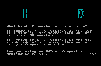
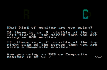
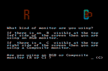
It wasn't possible for programs to detect what type of monitor a user had connected to their CGA card; as such, it was common for games to ask for this information. In order to make the choice easier for non-technical users who may not be sure what type of monitor they had, programs often took advantage of some of the artifacts and glitches to make clear for the user what type of display they had. BurgerTime is one such game; the game displays an "R" in the top left and a "C" obscured by a mug in the top right, each of which use different dithering patterns. On an RGB monitor, both letters are visible although the patterns of the mug over the letter make the "C" difficult to read. If the user has an early model CGA card, the "R" disappears almost completely as does the mug making the letter "C" very easy to read. On a newer CGA card, the colors are darker but still visible so the effect doesn't work as well; Here's the results:
| BurgerTime Monitor Selection Screen | |
| RGB Monitor | |
 |
|
| Composite Monitor - Old CGA Card | Composite Monitor - New CGA Card |
 |
 |
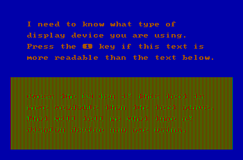
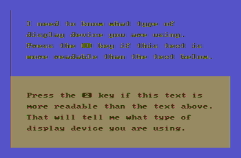
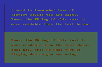
Another trick used by numerous games is to ask which paragraph of text is easier to read. Each section of text is a different color on top of a different background; usually what happens is one paragraph is clear and easily read while the other is partially (if not completely) obscurred by artifacts. As it turns out, newer model CGA cards have improved clarity for some text and color combinations over the older cards so this trick ends up not being quite the give-away for monitor type that it originally was. Shown below is Microsoft Decathlon; it's far from the only game to use such a screen but is pretty typical of what you would see. Notice how with a new CGA card both paragraphs of text are similar in legibility.
| Microsoft Decathlon Monitor Selection Screen | |
| RGB Monitor | |
 |
|
| Composite Monitor - Old CGA Card | Composite Monitor - New CGA Card |
 |
 |
In-game Graphics
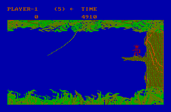
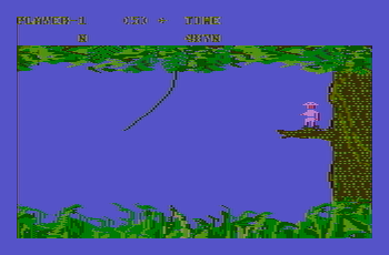
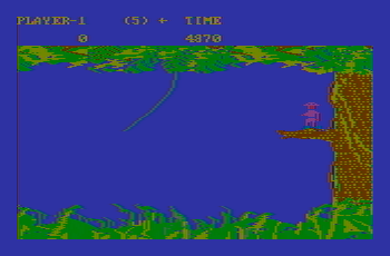
Jungle Hunt makes great use of CGA composite graphics; it also looks much better with an older model CGA card. If you take a look at the grass and trees, you'll find a lot more detail in them with the old CGA card; several shades of green are almost the same with newer cards making details almost completely blend together. Jungle Hunt is also one of a handful of games to make use of a trick to get more than 4 colors on the screen in 320x200 graphics mode by changing the palette at a particular scanline; note that the scoring area at the top of the screen is high intensity white compared with the rest of the screen which uses the low intensity red/green/brown palette. But why go through such a programming exercise just to make only the scoring area use a different palette? Turns out this isn't just a cosmetic choice and ends up making a lot more sense when you view the game with a composite monitor and older model CGA card; if the text had been left as brown (as it would have been for the palette used for the rest of the screen), it becomes nearly impossible to read. Here's some screenshots which do not have the palette change; you'll notice that the scores at the top are much clearer with a new CGA card or with an RGB monitor.
| Jungle Hunt (Without Palette Change) | |
| RGB Monitor | |
 |
|
| Composite Monitor - Old CGA Card | Composite Monitor - New CGA Card |
 |
 |
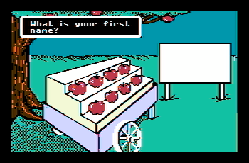
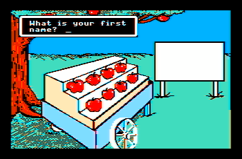
The Market Place by MECC also appears improved with an old model CGA card. Gameplay isn't affected, but you'll find more detail in some of the game graphics; as with Jungle Hunt some of the colors are much closer to each other with new cards making detail harder to see.
| The Market Place CGA Composite Screenshots | |
| Composite Monitor - Old CGA Card | Composite Monitor - New CGA Card |
 |
 |
 |
 |
When Composite Video Isn't Intended
As has been noted before, the IBM CGA card, the IBM PCjr, and the Tandy 1000 can all be connected to a composite monitor instead of an RGB monitor. Since games had no way of determining which type of monitor was being used, they would either ask what type of monitor was connected or used colors and dot patterns that looked decent for any monitor type. But what would happen if either you had a composite monitor and chose the wrong monitor type or the game didn't support composite graphics at all? The colors you ended up with tended to be a mess with lots of color fringes and other unintended consequences. Horizontal stripes were particularly common as they resulted from the checkerboard pattern dithering that was very commonly used by CGA games to simulate additional colors. If you happened to have an old model CGA card, games which used the red/green/brown palette with blue as a background could be a problem. As shown above, this color combination was one of several that caused a legibility problem. Usually, though, things still worked out well enough that the game was at least playable even if the colors seemed occasionally random and bizarre. In some cases, the results were even interesting. So here's a look at some of the varied results that can happen when you view a game not intended for composite monitors on a composite monitor...
The Colonel's Bequest
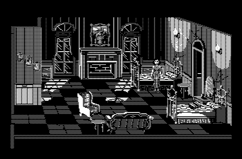
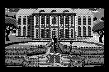
The Colonel's Bequest utilizes Sierra's SCI game engine; for the version of SCI used the best possible graphics settings provided a resolution of 320x200 with 16 colors. Early SCI games supported CGA either with 320x200 4 color graphics or 640x200 black & white graphics. The Colonel's Bequest uses the 640x200 option; the graphics are intended for an RGB monitor (the game setup menu refers to the choice as "CGA with RGB monitor"), but it ends up working surprisingly well with a composite monitor. The result is graphics with 4 shades of grey making the game quite clear and playable! This effect is true for most of the SCI games that support CGA; for the ones using the 320x200 mode the color burst bit is disabled so you still get a greyscale image with composite displays. The vertical stripes and other dithering patterns used to simulate 16 colors are less noticable, which may make the composite version easier to see depending on the quality of the monitors you're comparing. For The Colonel's Bequest, however, the greyscale graphics are not just functional but also fit the game stylistically. After all, why not have a 1920's murder mystery in black & white? Probably not what the developers and artists had in mind, but I think it works; here's a few screenshots showing how the game looks on a composite display.
| The Colonel's Bequest CGA Composite Graphics | |
 |
 |
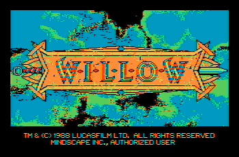
Willow
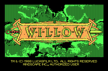
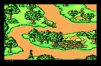
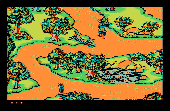
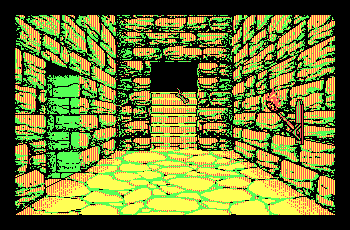
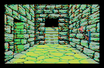
Generally, what shows as vertical stripes on an RGB monitor will become solid colors on a composite monitor. The CGA version of Willow, the game I love to hate, uses vertical stripes extensively. The colors may not make much sense, but the resulting graphics don't cause many problems that would hinder playing the game. The biggest problem I found is that the colors can shift rapidly in some scenes; for example, in the ice caves you have some frames with blues and greens for the walls which suddenly change to reds and oranges. On an RGB display this isn't particularly noticable as yellow and black stripes look more or less the same as black and yellow stripes. A similar effect happens in the dungeons; some rooms have better colors than others. The battle scene is the worst, although to be fair that scene is difficult to see even with an RGB monitor due to the complex background.
| Willow: RGB vs Composite Monitor | |
| RGB monitor | Composite monitor |
 |
 |
 |
 |
 |
 |
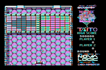
Arkanoid
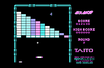
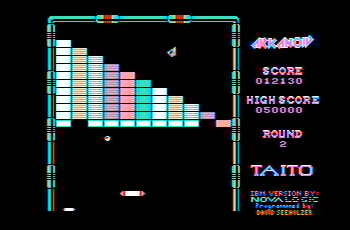
The PC version of the original Arkanoid wasn't a particularly impressive port; there's certainly no way the PC could have matched the arcade version, but even still the results were a little uninspiring. One noticable limitation is the lack of the colored backgrounds found in the arcades. With CGA graphics, this was perhaps not a terrible idea; without careful patterns and colors it would be too easy for the ball to become lost in the noise (a problem the CGA version of Arkanoid 2 does indeed have). Also, the fairly simple graphics make the game display more or less fine with a composite monitor even if that's not what was targeted. Not just Arkanoid, but any game that had relatively simple graphics translated reasonably to composite displays with not much different other than some extra color fringes here and there.
| Arkanoid: RGB vs Composite Monitor | |
| RGB monitor | Composite monitor |
 |
 |
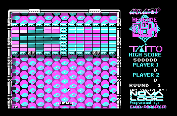
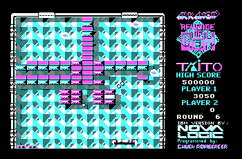
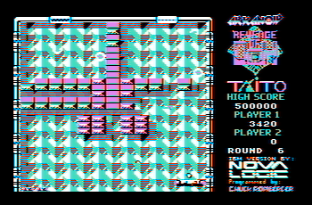
The PC version of Arkanoid 2 is a drastic improvement over its predecessor (and, as a bonus, one of the only versions along with the Apple IIgs to feature a level editor). But while the backgrounds look great in the 16 color EGA or Tandy 1000 modes, with CGA things become confusing at times; the limited colors can make the ball and paddle blend in to the background a little too much. If you attempt to use a composite monitor, some backgrounds are even worse due to the extra colors.
| Arkanoid 2: RGB vs Composite Monitor | |
| RGB monitor | Composite monitor |
 |
 |
 |
 |
The Fellowship of the Ring
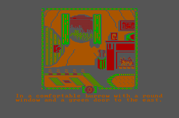
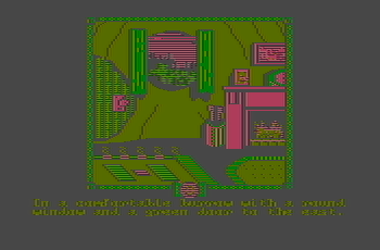
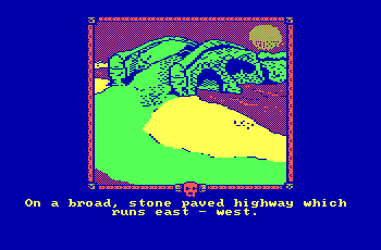
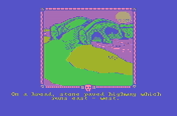
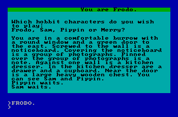
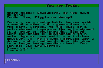
The above games don't become completely unplayable on a composite display; things don't always work out so well, however, and if you happen to have an old model CGA card then The Fellowship of the Ring is a good example of where results are less than ideal. Luckily, the game works with a few options including 40 column or 80 column text and also allows graphics to be turned off so the game can be played with a wide variety of hardware, even an IBM MDA card. If you wanted to see the pictures, however, you'll have a little less luck; the game makes good use of different CGA palette combinations to improve the graphics, but for some screens the text and background colors chosen cause the text to be rather difficult to read on composite displays.
| The Fellowship of the Ring: RGB vs Composite Monitor | |
| RGB monitor | Composite monitor |
 |
 |
 |
 |
| The Fellowship of the Ring 40 column Text Screen | |
| RGB monitor | Composite monitor |
 |
 |
Impossible Mission II
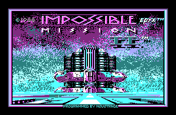
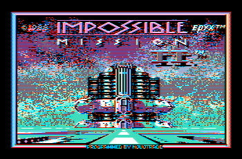
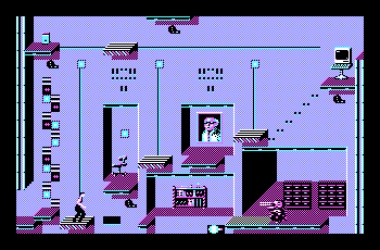
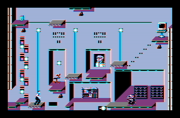
Finally, just for fun, here's Impossible Mission II. The results are pretty typical of CGA intended for an RGB monitor; the game uses the famous white/cyan/magenta palette, and extensively uses checkerboard dithering to simulate additional colors. This pattern results in horizontal stripes on a composite display, but otherwise the game remains reasonably playable. Take a look below...
| Impossible Mission II: RGB vs Composite Monitor | |
| RGB monitor | Composite monitor |
 |
 |
 |
 |
And That's a Wrap...
Given how common CGA graphics were for such a long time and the seemingly neverending supply of quirks, tricks, and oddities, I'm sure this won't be the last CGA related article. Hope you enjoyed taking a look at CGA graphics from a few different angles. With both IBM and third party CGA cards and various color, black & white, and monochrome monitors of a wide variety in use at the time, the “CGA experience” of the 1980's was far more varied than you may remember or your favorite emulator may even support; this update was intended to show just a few of the additional possibilities that existed. That's all for now, so until next time stay safe, stay healthy, and take care!